Safety Perception Surveys (Part 1)
By Kenny Young, CSP, ARM, AINS, CEAS
Director of Safety Services
Political strategist Lee Atwater is known for the quote, “perception is reality.” This statement couldn’t be any truer, especially as it pertains to safety. How employees feel about our safety program is what our program is. If employees perceive your safety management system to lack accountability, then they will act in a manner that ignores the need to be held accountable. If employees perceive your training to be boring an ineffective, no matter how great the trainer thinks the class went, then it’s boring and they didn’t learn anything. So how do we understand the perception of our safety program? By asking!
To keep this post digestible, this will be part one of a series. Future posts will dive deeper into specific questions and lines of questioning to answer exact challenges your organization is facing. Other parts of the series will get into more advanced analysis methods that can be used to interpret results such ANOVA, Chi-Squared tests etc. to determine the whether variables are dependent on one another. This way you can answer questions with statistical significance such as does year of experience relate to whether an employee is comfortable with going to his/her supervisor with reporting safety issues. I also plan to develop a post on the different tools you can use to make your surveys more efficient like Google analytics, Excel, and more. This part of the series will start with the basics at a 30,000-foot overview.
How do you develop a safety perception survey with a high return on investment? You can contact Trinity Safety Group. If we don’t answer (which we always do), then you can follow these steps to try it yourself.
Decide on a Survey Type
You can go with a canned survey or develop one internally. Canned surveys offer many benefits, such as being inexpensive, ability to benchmark results with other organizations, and hopefully they’ve been used successfully with other companies. In-house surveys can take a lot of time to build, especially when being done by someone who’s never created one. As a positive, they can be created to be very specific to your industry.
Know What Questions You Want Answered
This may seem easy, but I’ve seen several surveys developed that don’t get down to the questions the organization truly wants answered. Questions need to be asked that get valuable information. Leading questions won’t get the perception of your employees, but rather responses they think you want to hear. If you’re targeting a specific part of your safety management system, such as lockout/tagout, then ensure that your questions cover the topic in detail. Most perceptions surveys are best to be in broader topics that span the entirety of your safety management system to see if there are areas that require more in-depth analysis.
The Survey Must Be Reliable
Whichever way you choose, the survey needs to be reliable. This means that the survey should be able to provide repeatable results with consistent responses. Wording questions in a way that provides an obvious “correct” answer sways the survey tester. Also, not having an extensive variety of questions will lessen reliability. Obviously, over time you will expect changes to perception if you’ve made improvements to the program, but the survey process will have remained the same. It’s the process that we’re trying to replicate to maintain reliability.
Analysis
Surveys can be used to gather various types of data. Examples included ordinal (numbers), categorical, and open-ended questions answered through text. Each type of data is useful in its own way. However, significant errors can be made in survey design that make your data analysis not very useful. For instance, I’ve seen surveys where all the questions were yes or no. This makes it difficult, if not impossible, to determine how weak your organization is in a certain area because context is limited. Providing a range of scores between one to five (eg strongly agree, agree, unable to tell, disagree, strongly disagree) provides for a much more useful scoring mechanism for analysis.
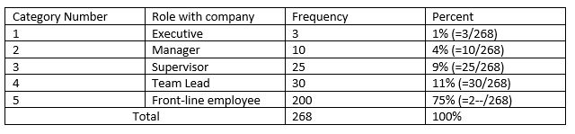
Categorical Questions – These assign numbers representative of different answer categories. The numbers have no meaning and are not used to add or subtract. The number one does not mean it is less important than the number three because it is a lower number.
Example:
What is your role with the company?
1. Executive
2. Manager
3. Supervisor
4. Team Lead
5. Front-line employee
To analyze categorical questions, it is best to use frequencies (count) to report the number of people that gave an answer to a specific question. Frequencies can be interpreted as percentages of the total sample in each category.
What is your role with the company?
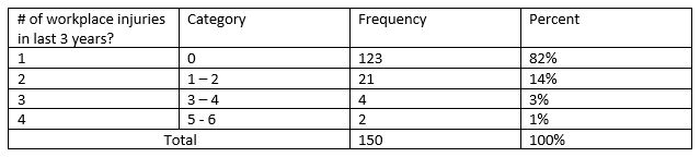
Ordinal Questions – In these types of questions the numbers have meaning. Answer categories are ranked from lowest to highest of vice versa. For the example below, an employee with an answer of five has sustained more injuries than an employee with an answer of one. Ordinal questions are also useful for gathering data on attitudes ranked on a scale from lowest to highest as mentioned above from strongly agree to strongly disagree. The downside is that the difference between category 2 and 3 may be significantly smaller than the difference between 4 and 5. There may not be a huge difference between “agree” and “unable to tell” as it pertains to whether or not safety rules are enforced but the difference between “disagree” and “strongly disagree” may be interpreted as an extreme problem when people are choosing “strongly disagree”.
Example:
How many workplace injuries have you sustained with our company in the last 3 years?
1. 0
2. 1 – 2
3. 3 – 4
4. 5 – 6
As with ordinal questions, frequency distributions are useful for categorical questions. These can be easily graphed for easy visual comparison.
Averages can be calculated using ordinal data, but they are difficult to interpret compared to averages for interval data/questions. The example below shows how mathematical averages may be calculated for categorical data.
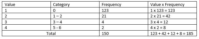
To determine the average number of injuries based on categorical data per employee, take the total “Value x Frequency” and divide it by total frequency.
185/150 = 1.23
Stopping here is the common pitfall of surveyors that don’t understand statistics and their uses. It is important to understand your potential error and the lowest and highest expected ranges. I’m not going to go into advanced statistics too much the next step is calculating the expected range for the average.
Error Band = (standard deviation/square root of respondents)*1.96
Error band = (5.826/12.247)*1.96 = 0.932
Lowest expected range of average = average – error band
Lowest expected range of average = 1.23 – 0.932 = 0.298
Highest expected range of average = average + error band
Highest expected range of average = 1.23 + 0.932 = 2.162
The analysis of this data tells us that the statistical range of the average number of injuries per employee over the last three years is between category 0.932 and 2.162 with a mean of 1.23. Because these numbers are representative of categories it makes it difficult to decipher but a general understanding is that most of our employees have experience 0 injuries in the past 3 years. It would likely be better to analyze this data as an interval question (next section) to get a true understanding.
Interval Questions – The types of questions use numeric data that have meaning which allows use to calculate frequency, averaging, and more advanced statistical analysis. Interval data is preferred to ordinal data when capturing information.
Example:
How many years have you worked for the company?
Answer: 5 years
How many workplace injuries have you sustained with our company in the last 3 years?
Answer: 2 injuries
The downside to using interval data is that they may be difficult to decipher through graphs and frequency distribution tables compared to the examples above. This is because there may be too many categories. For example, you may have 20 different answers for the number of years an employee has worked for the company and many of those would only have one respondent. To graph this question, it may be more user friendly to create categorical ranges such as 0 – 5, 6 – 11, 12 – 17, 28 – 23, and 24 + to reduce the number of bars on your graph.
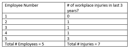
To calculate the average number of injuries per employee add all of the injuries and divide by the total number of employees.
Average number of injuries per employee = 6/5 = 1.2
The “1.2” in the interval data example is different from the “1.23” in the categorical data example. The 1.2 in this example provides an exact answer to our question of the average number of injuries each employee has had.
Stay tuned for a more in-depth look on each of these safety perception survey process steps.